Nexus PM
An AI-powered project management command center designed to predict risks, optimize team capacity, and provide a clear, unified view of project health.
The Problem: Reactive vs. Proactive
Modern project management is a chaotic dance of spreadsheets, task boards, and endless status meetings. PMs are drowning in data but starved for wisdom. Traditional tools are reactive, showing problems only after they occur. This forces teams into a constant cycle of firefighting, leading to budget overruns, missed deadlines, and team burnout.
Project Goals
- Shift project management from a reactive to a proactive, predictive discipline.
- Create a single source of truth that provides a holistic, real-time view of portfolio health.
- Empower PMs to make data-driven decisions quickly by simulating the impact of changes.
Project Type
Personal Concept Project
My Role: End-to-End Product Designer
- UX Researcher: Conducted interviews and competitive analysis.
- UX/UI Designer: Designed flows, wireframes, and high-fidelity mockups.
- AI Interaction Designer: Conceptualized AI-driven features.
Timeline
4 Week Sprint
Tools
Figma, Generative AI
Chapter 1: Research & Discovery
The first step was to validate my hypothesis by talking to real project managers and analyzing the existing tools they use. The goal was to find the gap between what current tools offer and what PMs truly need.
Competitive Analysis
Key Takeaways
The market is dominated by excellent task management tools, but they all share a critical flaw: they are reactive. They log what has happened but fail to predict what *will* happen. This creates a massive opportunity for a tool like Nexus PM, which is built from the ground up to be a proactive, predictive partner for PMs, not just a digital to-do list.
User Personas

Sarah, The Strategic PM
Manages a portfolio of 5-7 high-stakes projects.
"I need to see the forest, not just the trees. Give me the one number that tells me if a project is okay, and tell me where the next fire will be *before* it starts."

David, The Team Lead
Leads a team of 8 developers and designers.
"My team's well-being is my top priority. I need a way to protect them from overload and ensure workloads are fair, but I can't track every single task manually."
Chapter 2: Challenges & Constraints
Designing a truly intelligent PM tool presented several core challenges that shaped the design process, moving beyond simple feature implementation to tackle fundamental user needs.
Data Complexity
How do we unify disparate data from Jira, Slack, and GitHub into a single, coherent narrative without overwhelming the user with noise?
Building Trust in AI
How can we make AI recommendations feel transparent and reliable? Users must understand *why* the AI suggests a course of action, not just what it suggests.
Designing for Simplicity
How do we present powerful, complex analytics (like risk forecasts and simulations) in a way that is immediately understandable and actionable for a busy PM?
Chapter 3: Structure & Flow
With a clear understanding of our users and the market gap, the next step was to define the application's structure and map out the critical user journeys.
Information Architecture
User Flows
To map the complete application experience, we visualized the primary user journeys. A key design goal was to minimize complexity and highlight how AI assists users in achieving their goals efficiently.
This flow shows how a strategic PM like Sarah can quickly understand the ripple effects of a potential decision without manual calculation.
Chapter 4: Early Sketches & Ideation
The initial design phase focused on low-fidelity wireframes to quickly explore layouts for the core screens. The goal was to establish a clear visual hierarchy for complex data and test fundamental interaction concepts before committing to high-fidelity designs.
Dashboard Exploration
Early sketches focused on a modular, card-based layout to surface the most critical information first.
Project Health View
Ideating on how to present project health scores and contributing factors clearly and concisely.
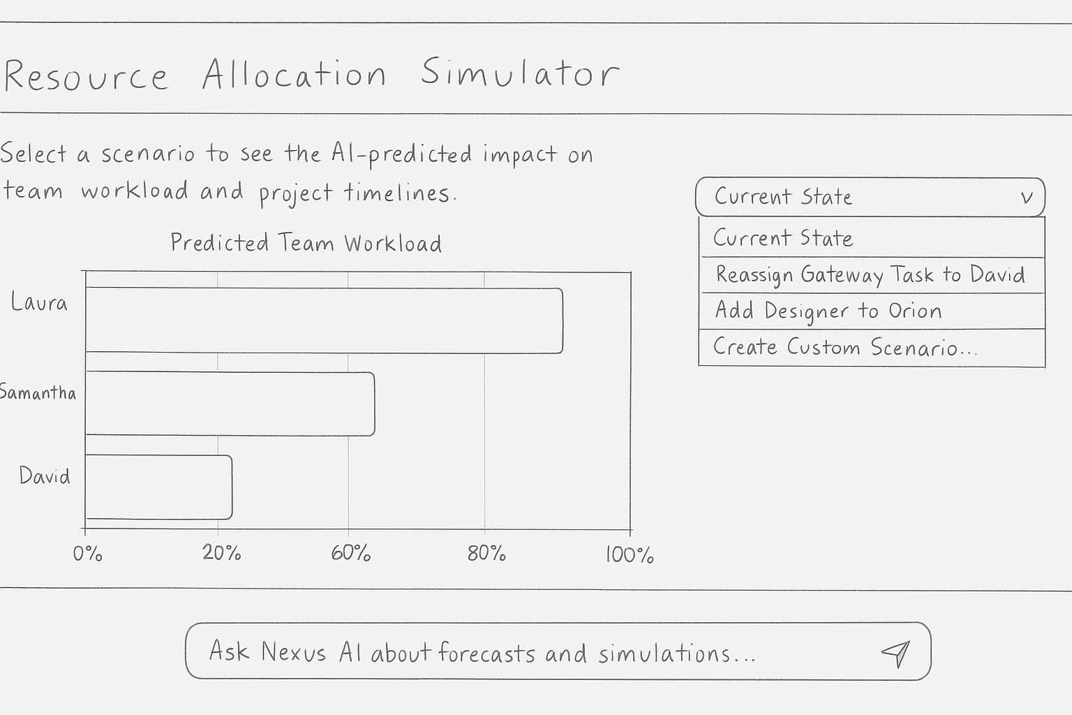
Team Resource Allocator
Exploring ways to visualize team workload to quickly identify who is over or under capacity.
Key Takeaways from Lo-Fi Testing
Early feedback from users indicated a strong preference for the modular dashboard, as it allowed for personalization. They found the initial simulation input too complex, which led to a simplified, scenario-based approach in later iterations. This phase was crucial for validating the core structure before investing in detailed visual design.
Chapter 5: Visual Design & Style Guide
The visual design of Nexus PM is clean, professional, and data-forward. It's designed to feel like a calm, intelligent command center, not a cluttered task list.
Typography
The Inter typeface was chosen for its excellent legibility on screens, crucial for a data-heavy application. Its clean, neutral forms allow the data to take center stage.
Heading 1
Welcome back, Alex
Heading 2
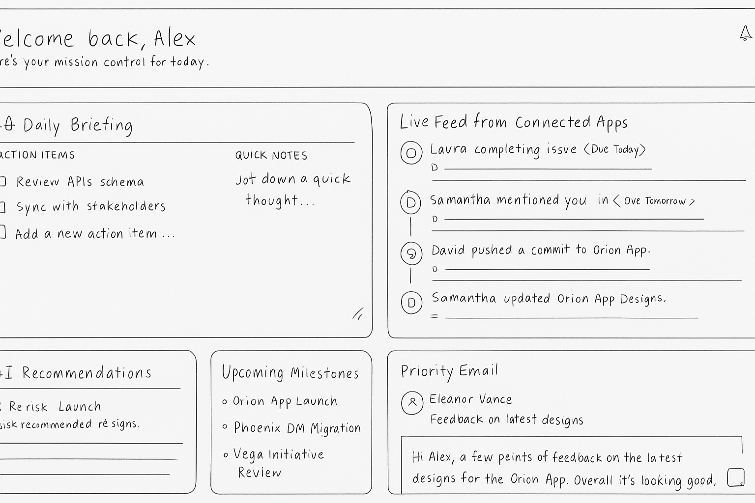
AI Daily Briefing
Body Text
Your portfolio health is strong at 85/100.
Color Palette
The palette uses a calm base of slate grays with a vibrant purple as the primary action color. Green, yellow, and red are used purposefully as status indicators to convey information at a glance.
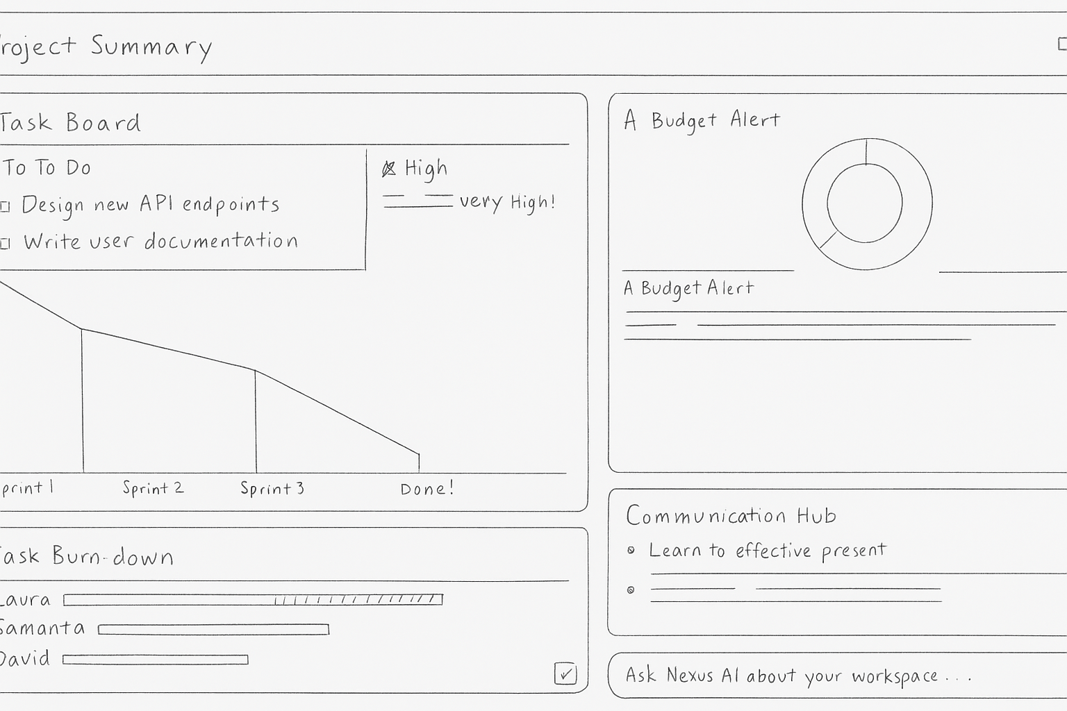
Chapter 6: The Final Product
The result is a clean, data-rich interface that feels less like a task tracker and more like an intelligent partner. The UI is designed to build trust in the AI by making its insights transparent and its recommendations easy to understand.
Outcome & Reflection
Nexus PM is a conceptual leap from reactive task tracking to proactive, intelligent project orchestration. The key lesson from this project was the importance of designing for trust. AI features are only useful if users trust the insights they provide. This meant making the AI's reasoning as transparent as possible and always giving the user the final say.
Future Work: The next step would be to conduct rigorous usability testing, especially on the Impact Engine, to refine the interaction model. I would also explore deeper integrations with financial and HR systems to enrich the AI's predictive capabilities.